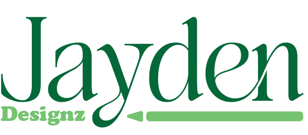
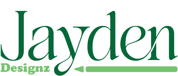
Personal Logo
The Jayden Designz logo features a bold, modern design highlighted by a fresh green color scheme, symbolizing creativity and growth. The word "Jayden" is prominently emphasized to serve as the primary identifier of the brand, making it instantly recognizable. Beneath the text, a sleek pen graphic subtly reinforces the brand’s connection to art, design, and creativity. The overall look is clean, professional, and expressive — perfectly capturing the essence of a creative design studio.
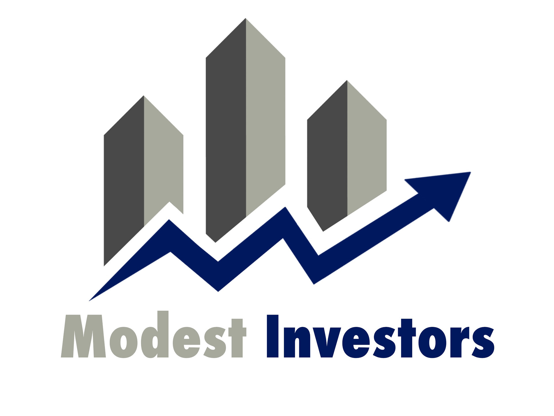
Investors Logo
The logo for Modest Investors reflects stability, growth, and financial expertise through a clean, modern design. A bold blue upward-trending line symbolizes rising investments and opportunity, while three sleek gray buildings of increasing height are strategically placed along the line, representing steady growth and financial resilience. The blue and gray palette conveys trust, wisdom, and strength, making this logo a distinctive, professional mark of confidence in the investment world.
Clinic Logo
The logo for Moorer Healthcare embodies trust, vitality, and modern care with a clean, professional design. At its center is a circular health symbol in calming shades of green and blue—colors that represent growth, healing, and stability. Inside the circle, a subtle zigzag line echoes the form of a heartbeat or life signal, symbolizing vitality, resilience, and the continuity of care. The simple yet meaningful design reflects the clinic’s commitment to patient wellness and forward-thinking healthcare. With its fresh color palette and clear symbolism, the logo inspires confidence and connection, making it instantly recognizable and reassuring to the community it serves.

Dog Grooming Logo
The logo for the dog grooming business radiates warmth and charm with a playful, inviting design. Set in a cheerful peanut butter and pink color theme, the centerpiece features an adorable, happy dog splashing around in a bubbly tub. The dog’s playful expression captures the fun, friendly atmosphere of the grooming service, while the soft, sweet color palette creates a welcoming and pet-loving vibe. This logo beautifully balances professionalism with personality, making it instantly appealing to pet owners.
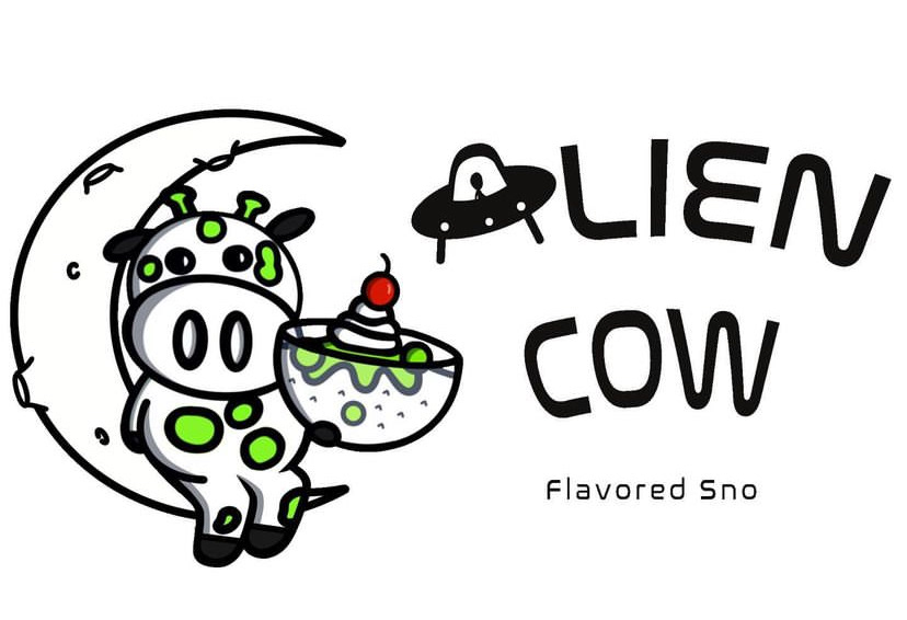
Sno Cream Shop Logo
The logo for this whimsical sno cream shop brings intergalactic fun to life with a playful, space-themed design. The centerpiece features an adorable, kid-friendly alien cow cheerfully perched on a crescent moon. The cow—complete with tiny antennae and a happy grin—holds a scoop of colorful sno cream, making it clear this treat is out of this world. The business name is styled in a bubbly, “nasalization”-inspired font with a UFO in the shape of an A , giving the logo a futuristic touch while staying fun and approachable. The overall design strikes a perfect balance between imaginative charm and sweet indulgence, making it instantly lovable for kids, families, and sno cream fans of all ages
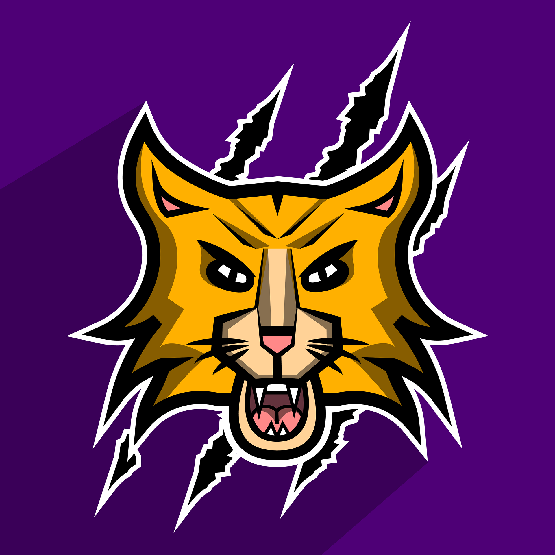
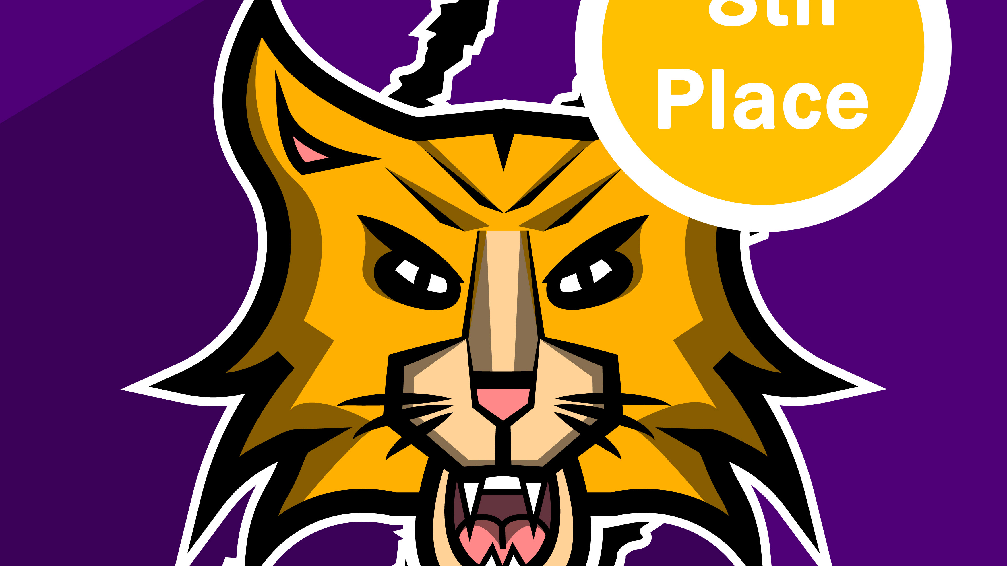
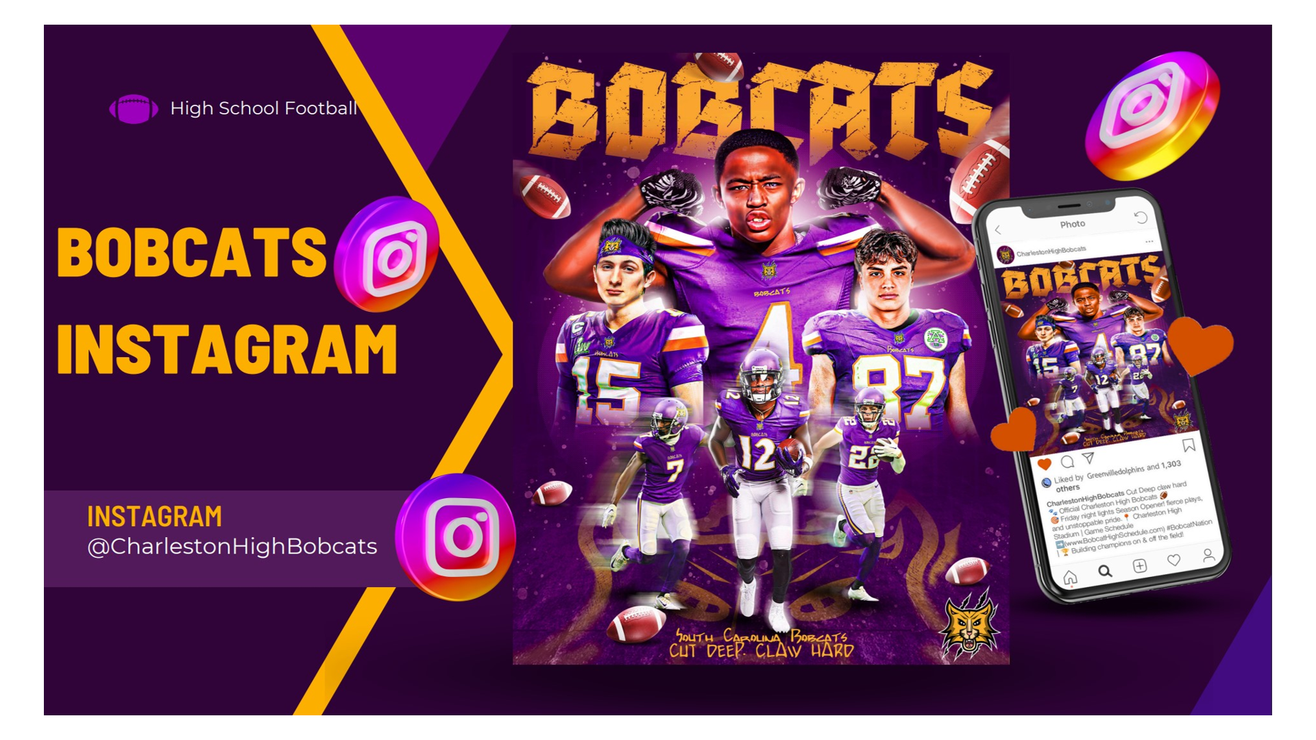
High School Football Mascot
A bold, claw-inspired logo created for a fictional high school football team. Designed to reflect the team's fierce energy and school pride, with sharp lines and a strong color palette to match the team's motto: “Cut Deep. Claw Hard.”
Driving School Logo
The Divine Favor Driving School logo features a bold, sharp font crowned with a halo, symbolizing protection and divine guidance. A dynamic car wheel paired with an angel wing in motion represents progress, safety, and support on the road. The design perfectly blends spiritual symbolism with driving elements, making it memorable and meaningful.

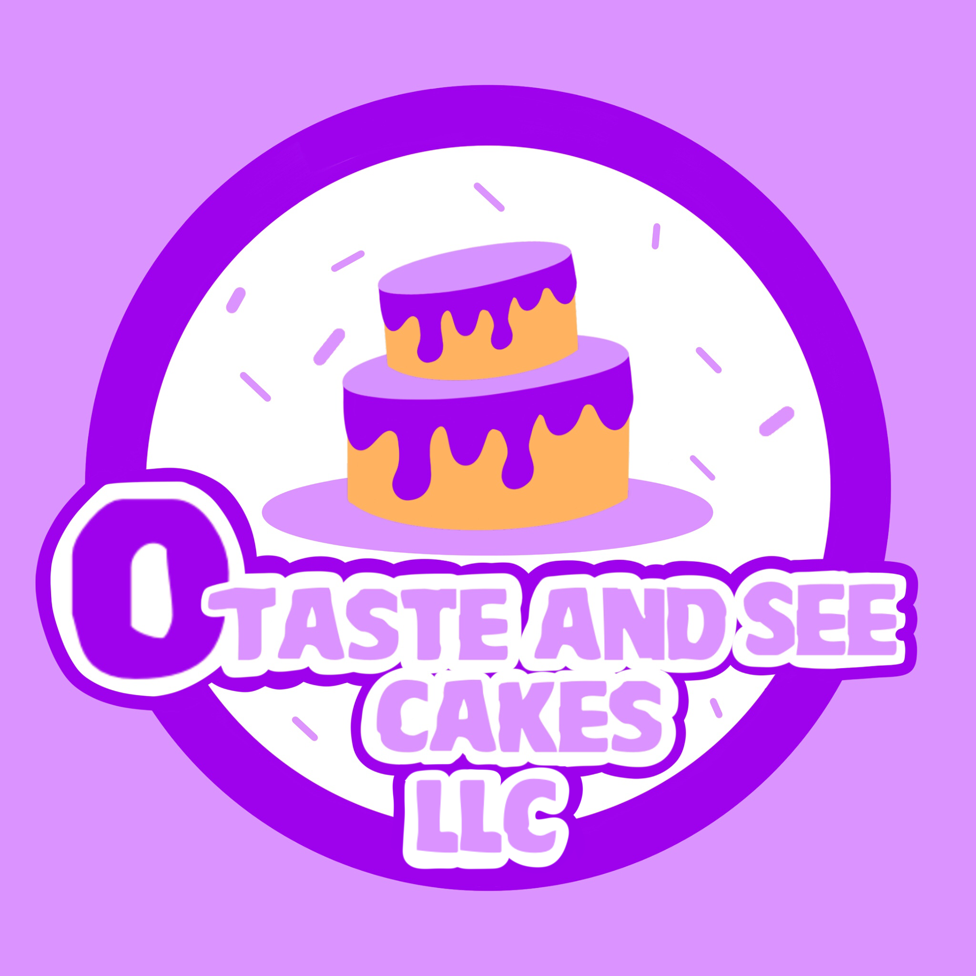
Bakery Logo
The O Taste and See Cakes logo features a playful, crumbly-style font in soft, light purple, capturing the warmth and sweetness of homemade treats. Colorful sprinkles are scattered around the logo, adding a fun, festive touch that hints at the joy found in every bite. The design beautifully blends delightful bakery elements with an inviting, cheerful color palette, making it a memorable and heartwarming symbol for dessert lovers to instantly recognize.
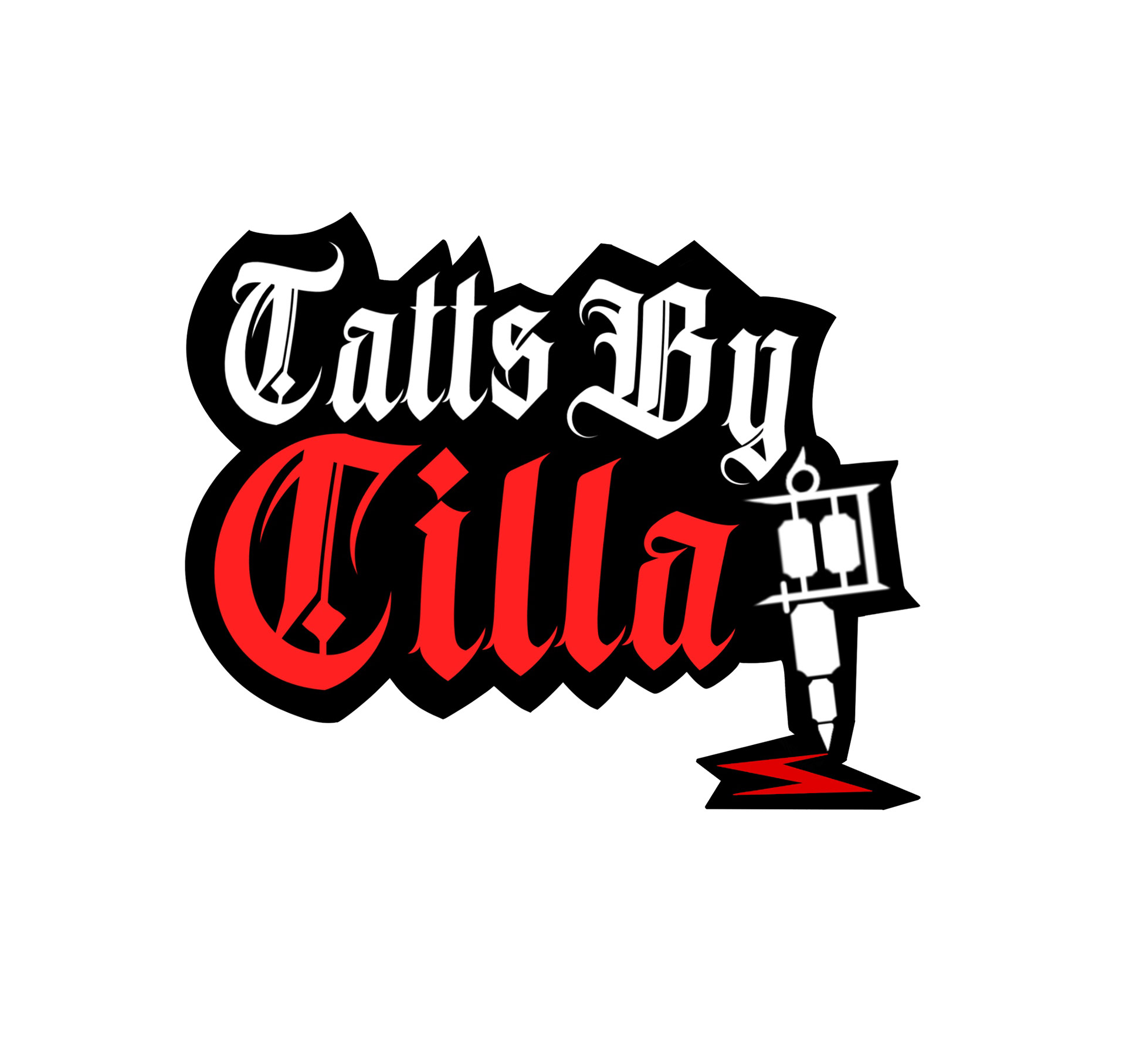
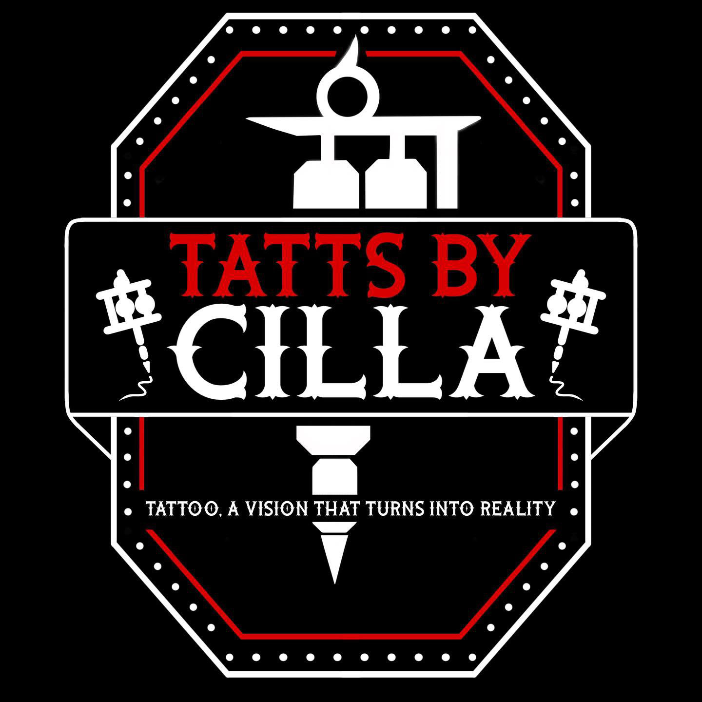
Tattoo Shop Logo
The first logo keeps it clean and simple with a sharp, modern font. The name "Cilla" stands out in striking red, adding a pop of personality against the bold lettering of "Tatts by Cilla." A tattoo pen sits alongside the text, leaving a playful scribble, symbolizing creativity in motion and the start of every great tattoo.
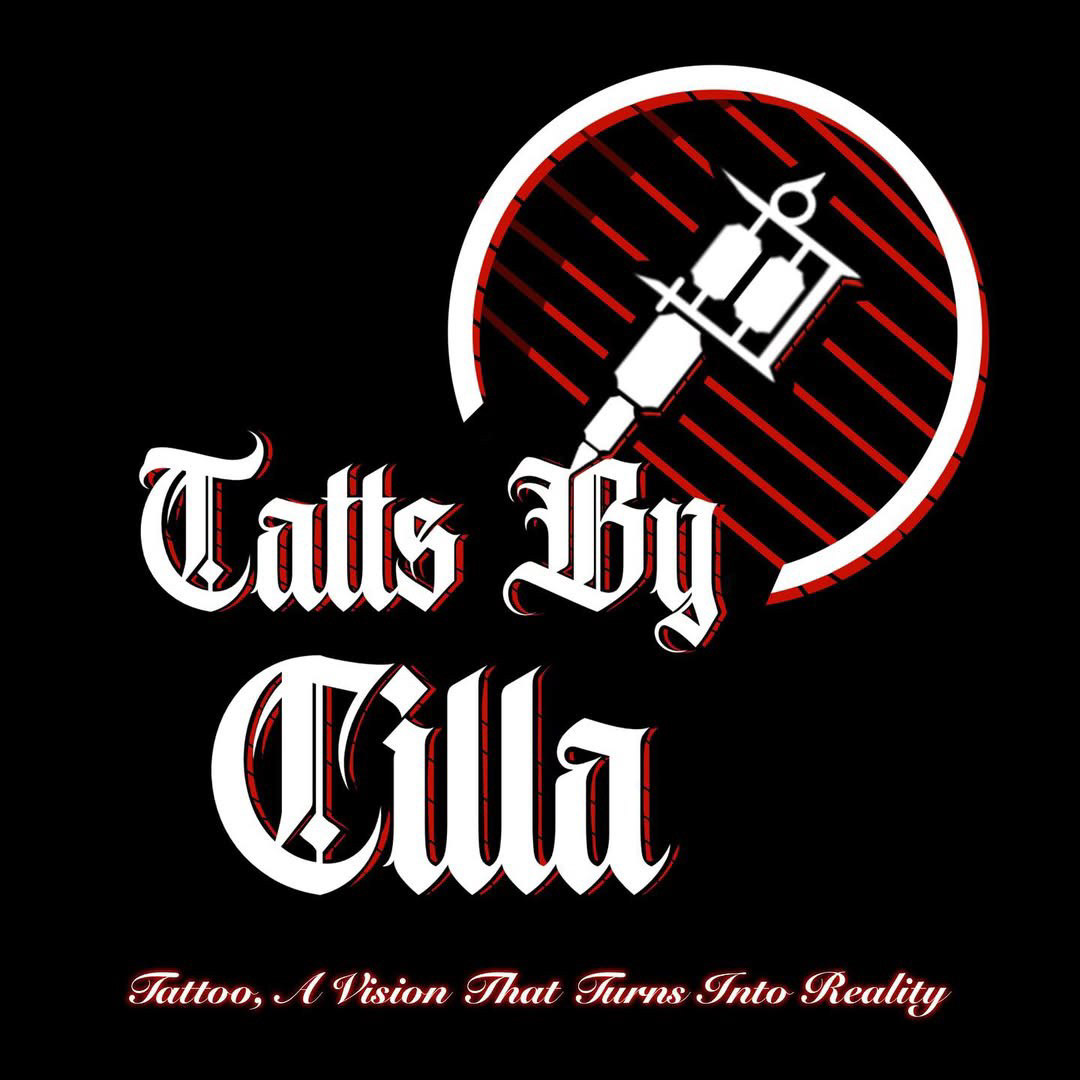
The second logo introduces a sense of vision and purpose. It features "Tatts by Cilla" paired with the empowering motto: "Tattoo a vision that turns into reality." A tattoo gun rests in the top corner, encircled to create a bold, enclosed emblem. This design balances modern edge with a meaningful message, representing how each client’s idea is brought to life.
The third logo is the most elaborate, designed to make a powerful statement. The same inspiring motto frames the design, enclosed within an ornamental border that elevates its presence. Two tattoo guns flank the text on either side, emphasizing craftsmanship and precision. This concept blends vintage tattoo parlor flair with modern aesthetics, making it a bold, unforgettable mark for the brand.
In Conclusion
In conclusion, my logo designs aim to go beyond aesthetics by combining bold creativity, clean structure, and meaningful symbolism. Each piece is carefully crafted to reflect the unique identity and values of the brand it represents. Through the use of striking colors, clear typography, and purposeful graphic elements, I create logos that are both memorable and versatile—designed to tell a story and make a lasting impact across any platform.